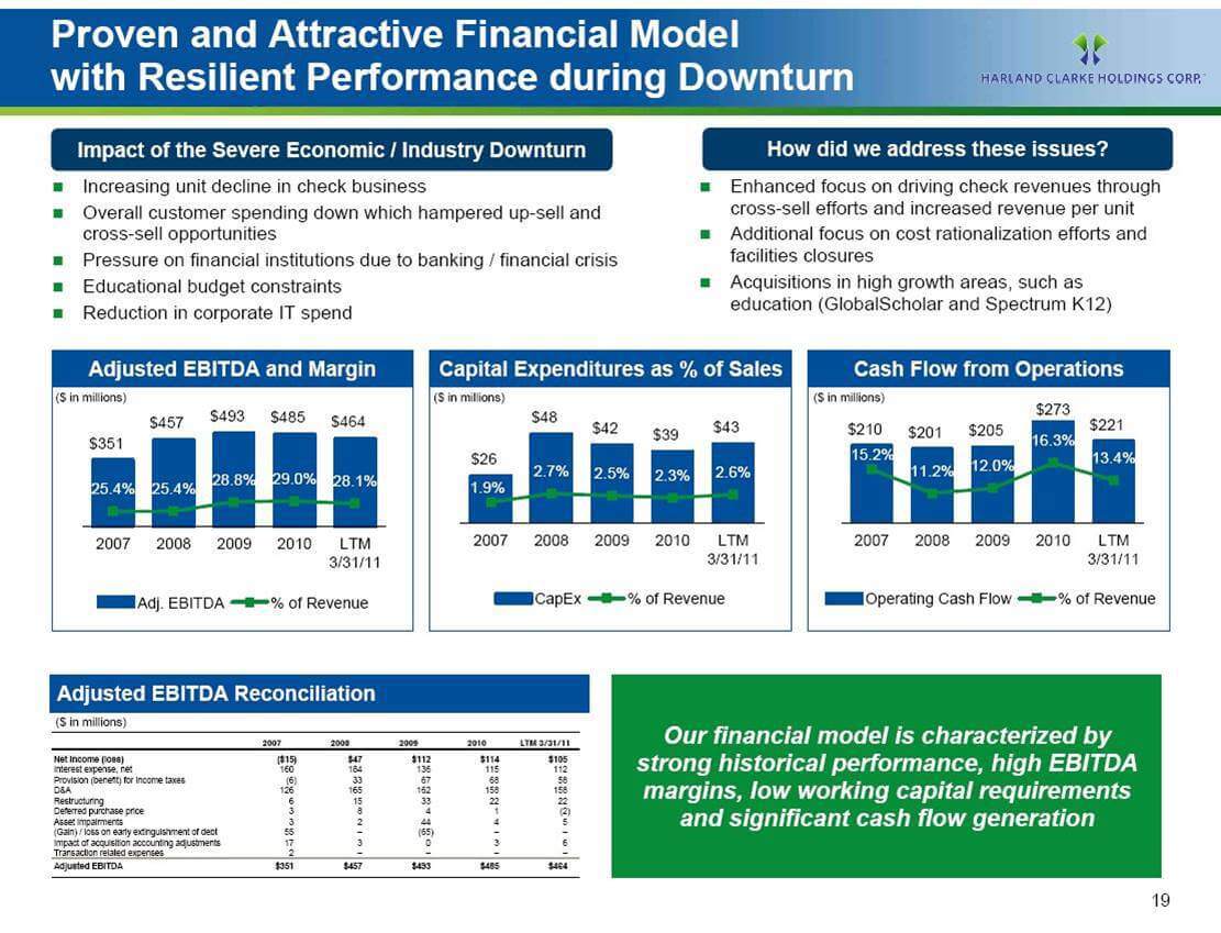
We've all been in bad PowerPoint presentations. For some reason, nobody screams when a slide is shown that has 300 words and the presenter reads everything word-for-word. I've had enough. We need to do better.
Less of this:

More of this:

The more information you put on a slide, the less people will listen to you. They'll spend the entire time trying to figure out what the heck is going on and miss out on your point.
The slides aren't the presentation. They should add to what you're talking about.
Guidelines for Better Slides
Use Well Made Pictures
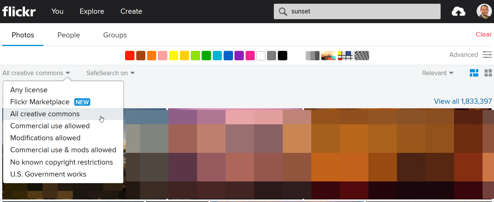
Flickr has a ton of gorgeous pictures from photographers. You can even use them for free as long the creator has applied a Creative Commons license.

Always Attribute
Once you find a photo from Flickr that has a Creative Commons license, make sure you show proper information on where you got the image. You'll see in my "Act Your Wage" slide above, I show a link for each photo I'm using.
Less Text
Your slide's text should be limited to ONE thought and less than FIVE words. This rule of thumb will force you to focus on the content of your presentation.
More Slides
When you're forced to limit the number of thoughts on a slide to just one, you end up with more slides. This will improve your presentation's flow and will engage your audience. Keep them guessing with your amazing slides.
More Information
There's a great SlideShare presentation on improving slides by Mike Jeffs. Check it out: